Zoetropes
A Secret of the City
While riding the Q train from DeKalb Station in Downtown Brooklyn towards Manhattan, if you look out the window of the train on the same side that you boarded, you’ll find something amazing. It’s pretty easy to miss, but if you look closely, you’ll see a wall illuminated by ceiling lights with a long, intricate mural. As the train moves north, a dividing wall will separate you and the mural, with breaks in between the wall at even intervals. Look between these slits at the wall behind them, and you’ll see a moving picture!
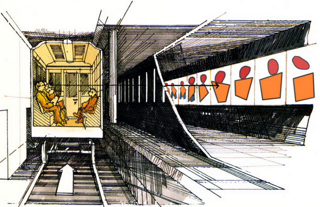
A cartoon rendering of the Zoetrope in the New York City subway system, from
this article
where you can learn more about its history.
This is called a “Zoetrope”, a type of optical illusion that gives the impression of motion through the repetition of “frames” being illuminated at a constant interval. It’s a technique that existed long before the modern rail system, and it’s an important concept in the history of animation.
In this post, we’ll explore the basics of these curious illusions and even create our own Zoetrope animations using CSS. By understanding how Zoetropes work, you can appreciate the artistry behind them and learn how to make your own mesmerizing animations. Let’s dive in!
How does a Zoetrope work?
A Zoetrope is a device that creates the illusion of motion through a series of static images or objects. Traditional Zoetropes consist of a cylindrical drum with slits cut vertically along its sides. Inside the drum, a sequence of images or drawings is placed. When the drum is spun, and a viewer looks through the slits, the images appear to move due to the phenomenon known as persistence of vision.
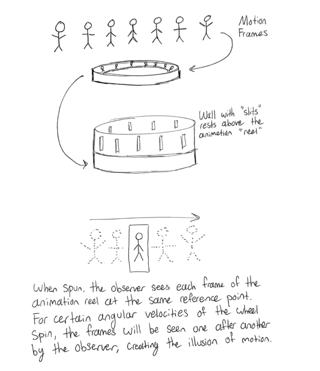
This effect occurs because our brains retain images for a fraction of a second longer than they actually appear, allowing us to perceive a continuous, fluid motion. For other experiments related to this phenomenon, see here.
More generally, a zoetrope is an instrument that utilizes the persistence of vision for the purposes of animation. Some zoetropes use strobe lights to break up the space between moving frames. Others have their animation frames on an unmoving wall, where the observer is responsible for moving to see the animation.
3D Zoetropes with Strobe Lights
One of my all-time favorite music videos is “Cash In, Cash Out” by Pharrell Williams, 21 Savage, and Tyler, the Creator. This video features the artists as 3D stop-motion caricatures, animated on a spinning structure. As the camera moves through different “layers” of this structure, it reveals a variety of surreal and dynamic backgrounds, each filled with vibrant colors, playful animations, and unexpected visual elements.
The music video features a spinning zoetrope with a strobe light. As the zoetrope spins around, the strobe is flashed at the exact rate that the frames of the zoetrope are moving, which causes a 3D illusion of movement. While the music video itself is mostly CGI, the technique is valid. Below is a video that further explains how it works:
We’ll implement both a slit-based and a strobe-based (2D) zoetrope using CSS and JavaScript. Let’s begin!
Emulating a Zoetrope (with JavaScript and CSS)
Now that we understand what a Zoetrope is and how it works, let’s simulate one together, making this type of animation accessible to anyone with a laptop and internet connection.
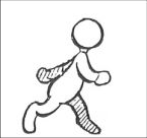
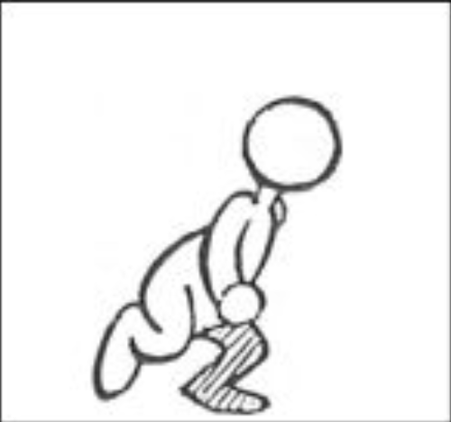
First, we need animation frames. I would usually draw something myself, but for the sake of this exercise, I decided to grab 12 frames from this artist’s lecture notes.


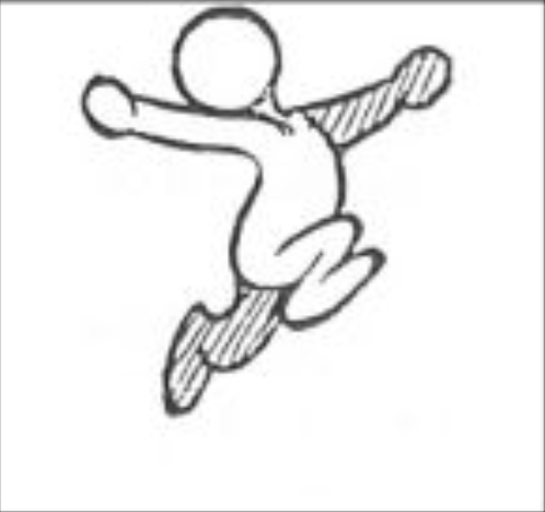
Let’s go ahead and make these frames move, to simulate our animation reel:
.zoetrope {
    display: flex;
    position: absolute;
    height: 100%;
    animation: scroll ${(props) => props.frameCount / props.fps}s linear infinite;
}

@keyframes scroll {
    0% { transform: translateX(0); }
    100% { transform: translateX(-100%); }
}
And put all our images into a photo carousel:
<div className="zoetrope">
  {Array.from({ length: frameCount }, (_, index) => (
    <img
      key={index}
      src={`${filePath}${index + 1}.png`}
      alt={`Frame ${index + 1}`}
      className="frame"
    />
  ))}
</div>
Et voila! Drag the slider to the left to speed up the frame rate, and to the right to slow it down.
Zoetrope with Slits
First, let’s create a zoetrope using the persistence of vision phenomenon. We can add two divs on top of our photo carousel and control their distance from each other.
<div class="zoetrope-container" ...>
  <div className="zoetrope">
    {Array.from({ length: 24 }, (_, index) => (
      <img
        key={index}
        src={`${filePath}${(index % 12) + 1}.png`} // Loop through 12 frames twice for seamless looping
        alt={`Frame ${index + 1}`}
        className="frame"
      />
    ))}
  </div>
  <div className="slit left-slit"></div>
  <div className="slit right-slit"></div>
</div>
We can control the width of our slits with css:
  .slit {
    position: absolute;
    top: 0;
    height: 100%;
    background: black;
    pointer-events: none;
    transition: width 0.2s ease;
  }

  .left-slit {
    left: 0;
    width: ${(props) => props.slitWidth}px;
  }

  .right-slit {
    right: 0;
    width: ${(props) => props.slitWidth}px;
  }
to create a “curtain” over our photo carousel to emulate a traditional zoetrope. Try adjusting the speed and the slit size using the sliders to create the illusion of a running man.
Zoetrope with a Strobe Light
Now to make this a zoetrope, we’ll have to emulate a strobe light, or a “slit,” that blocks the observer’s view of the animation reel between frames. We can do this with CSS.
To create the illusion of motion, we can flash an opaque div in front of the animation reel at the same rate as the images move. This will make it appear as though the frames are updating every n seconds instead of rotating.
  .overlay {
    position: absolute;
    top: 0;
    left: 0;
    width: 100%;  // Take up the full width of the animation reel
    height: 100px;
    background: black;
    pointer-events: none;
    animation: blink ${(props) => 1 / props.fps}s steps(1) infinite;
  }

  @keyframes blink {
    0% {
      opacity: 0;
    }
    15% {
      opacity: 1;
    }
  }
And put this overlay div right inside our container:
<div class="zoetrope-container" ...>
  <div className="zoetrope">...</div>
  <div className="overlay"></div>
  <div class="zoetrope-container" ...></div>
</div>
When you increase the speed (decrease the time that each frame is visible for), the animation gets more and more fluid.
Food for thought: for sufficiently fast animations, the “blinking” CSS div can sometimes appear completely solid, or even blink at uneven intervals. Why do you think that is?
Why?
The purpose of recreating a system is to more intimately understand it. We’ve seen how a simple optical illusion can transform static images into fluid motion, and now we know how to make them ourselves. From the New York City subway system to the innovative music videos of today, zoetropes continue to captivate people everywhere. Of course, modern digital animation doesn’t require us to emulate zoetropes in order to animate frames, but the process of doing so is fun!
I was inspired to write this article after seeing the Downtown Brooklyn subway zoetrope first-hand and wondering how this type of illusion actually worked. Building understanding from the ground up is a wonderful way to learn something new. Programmers have the unique ability to simulate almost anything they can conceive, and web developers have the power to share these simulations—and their ideas—with the world.
Written and Created by Davis Keene